When Light Moves Across Oxidized Metal
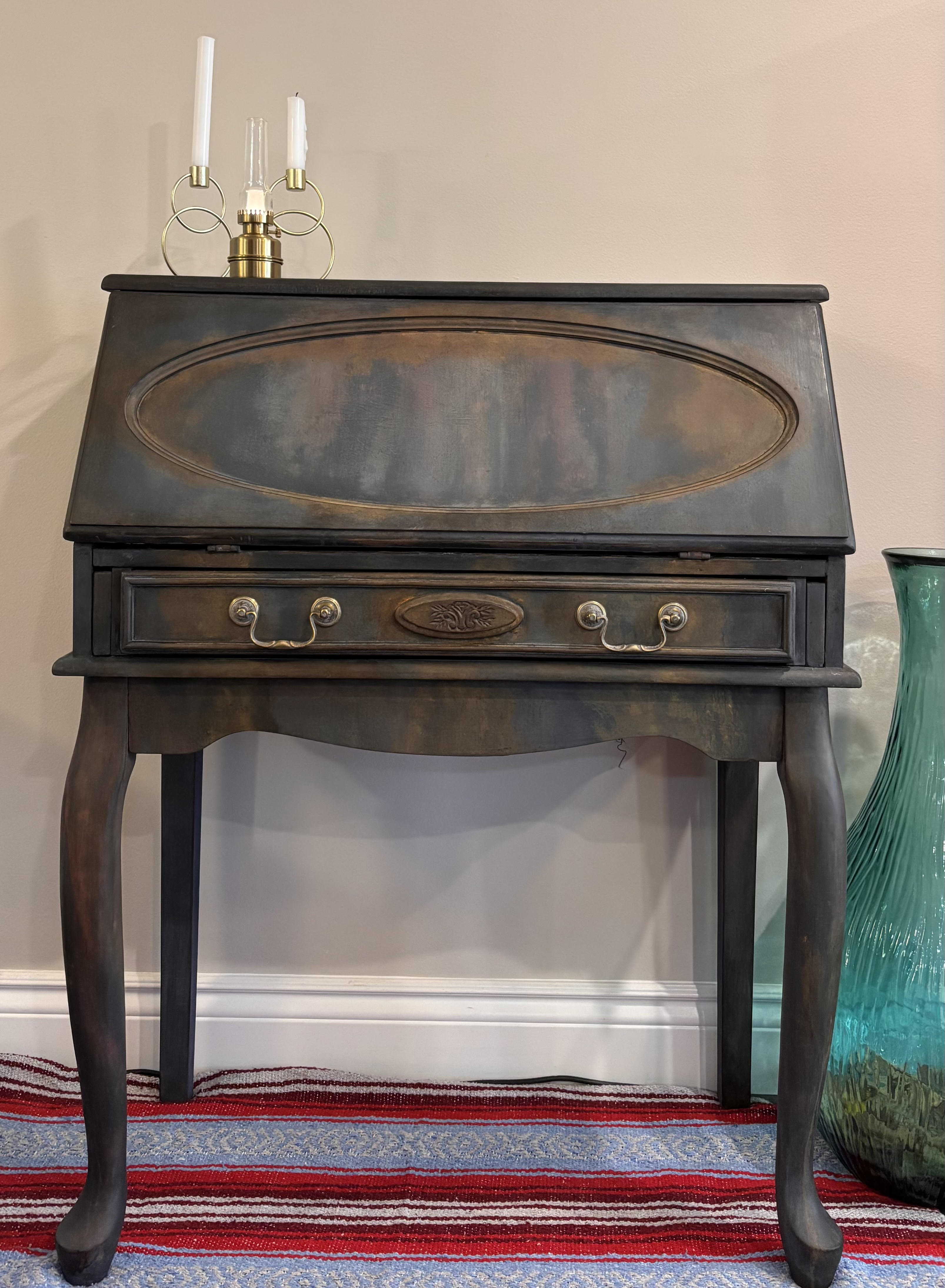
Some furniture demands to be approached slowly, to be studied from different angles as light shifts across its surface. This secretary desk achieves that complexity through sophisticated multi-color blending, creating a finish that reads less like paint and more like oxidized metal, ancient patina, or storm clouds moving across copper. Five Annie Sloan Chalk Paint colors interact across the surface through atomized misting, sea sponge texturing, and rapid wet blending. Open the slant-front lid to discover an interior transformed with the same atmospheric technique, then enriched with handmade French decoupage paper in cream and gold, creating a private world of pattern and light.
At a distance, the desk reads as dark and dramatic with warm undertones. Up close, the interplay of five colors becomes apparent: cool blues and grays, warm oranges and reds, soft green-gray threading through. The finish suggests weathered copper, ancient bronze, rusted iron softened by verdant oxidation—surfaces that have absorbed centuries of environmental exposure. This is not distressing. This is alchemy.
The Five-Color Palette
Building Atmospheric Depth
Oxford Blue
Rich navy-purple providing deep, cool undertones and shadow areas
Graphite
Charcoal gray creating transitional zones and adding depth without pure black heaviness
Barcelona Orange
Warm rust-terracotta suggesting oxidation, aged metal, earth
Honfleur
Soft sage-gray with green undertones adding coolness and complexity
Primer Red
Deep burgundy-red introducing warmth and suggesting aged patina or rusted metal
Why This Works: These five colors weren't applied in distinct zones or layers but rather interwoven across surfaces, creating the kind of complex color relationships that develop on metal exposed to weather, on ancient painted surfaces where multiple repaintings show through, or on natural materials that shift color as minerals oxidize.
Three Blending Techniques, One Masterpiece
Creating Atmospheric Complexity
Atomizer Application: Clouds of Color
Using a spray atomizer (fine mist sprayer), the artist applied thinned paint in delicate clouds across surfaces. This technique creates soft, diffused color that appears to float on the surface rather than sitting heavily. The atomizer allows for subtle color transitions, overlaying of translucent veils, and the kind of soft edges that mimic natural weathering or oxidation patterns.
Effect: Oxford Blue misted over Barcelona Orange creates shadowed rust. Honfleur atomized across Graphite produces aged verdigris effects. Each color shows through previous layers, creating dimensional complexity.
The atomized layers build atmospheric depth—like fog rolling over a landscape or smoke drifting across old metal.
Sea Sponge Texturing: Organic Irregularity
Natural sea sponges, with their irregular porous structure, were loaded with paint and dabbed, pressed, or dragged across surfaces. This technique creates organic texture variation, mottled effects, and the kind of irregular patterning that appears on weathered surfaces, corroded metal, or ancient painted plaster.
Effect: Some areas receive heavier sponge application creating deeper color saturation, while others show lighter touches allowing underlayers to dominate. The irregular nature of sponge texture prevents the finish from reading as mechanical or uniform.
The sea sponge adds tactile dimension—you can almost feel the oxidation, the mineral deposits, the centuries of weathering.
Rapid Wet Blending: Where Colors Dissolve Into Each Other
Working quickly while paint remained wet, the artist blended adjacent colors directly on the furniture surface using brushes, cloths, or blending tools. This technique requires speed and confidence. The artist pulled one color into another, creating gradient zones where boundaries dissolve and colors participate equally rather than one dominating.
Effect: The rapid blending creates the kind of color transitions that appear on oxidizing metal where rust bleeds into verdigris, on ancient frescoes where pigments have migrated and mingled over centuries, or on natural materials where minerals create flowing color patterns.
This is where the magic happens—colors meeting, merging, transforming each other in real time.
The Combined Effect
Using all three techniques in concert, the artist created surfaces with remarkable complexity. The atomized layers create softness, the sponge work adds texture, and the wet blending ensures colors flow into each other organically. The finish carries the visual weight of age and material transformation—it suggests weathered copper, ancient bronze, rusted iron softened by verdant oxidation, or painted surfaces that have absorbed centuries of environmental exposure.
The Classic Secretary Desk Form
Centuries of Elegance and Function
Slant-Front Lid
The angled top surface lifts up and opens forward, revealing the interior writing surface and storage compartments. When closed, the slant front provides a display surface; when open, it creates a workspace.
Single Full-Width Drawer
Below the slant lid sits a drawer with two bail pull handles and a central decorative oval escutcheon plate. The hardware retains its aged brass/bronze patina, harmonizing beautifully with the warm orange and red tones in the painted finish.
Cabriole Legs
Gracefully curved legs in the French Provincial or Queen Anne style, adding elegance and ensuring the piece doesn't feel heavy despite the dark, complex finish.
Shaped Apron
The bottom edge curves organically, softening the rectangular form and adding visual grace.
Compact Proportions
Secretary desks were designed for personal correspondence and small-scale work, fitting comfortably in bedrooms, parlors, or alcoves rather than demanding the space of full-size writing desks.
Quality Construction
The construction indicates quality furniture: solid wood with traditional joinery, worth the significant finishing effort invested.
The Interior Revelation
French Decoupage Meets Atmospheric Paint
Open that slant front and the complexity doubles. The interior received the same five-color atmospheric treatment as the exterior—the same atomized misting, sea sponge texturing, and rapid blending creating weathered, oxidized surfaces inside the desk's private compartments.
But the artist didn't stop there. Across the interior surfaces, handmade French decoupage paper in cream and gold adds pattern, texture, and refined detail.
The French Decoupage Paper
This isn't printed wallpaper or commercial shelf liner. This is handmade decorative paper from France, created through traditional methods. The paper carries pattern in cream and gold tones, bringing ornamental detail that contrasts beautifully with the painterly, organic finish surrounding it.
- Visual Relief: After the moody exterior colors, the eye encounters lighter, warmer tones that feel welcoming and refined
- Color Harmony: The gold in the paper harmonizes with the Barcelona Orange and Primer Red undertones, creating color continuity despite the contrast
- Textural Contrast: The organic, painterly exterior gives way to ordered, decorative pattern inside
- Historical Lineage: France has centuries of tradition in fine paper making and decorative printing—this paper connects the piece to that legacy
Why This Interior Works
The decoupage application involved carefully measuring and cutting the paper to fit each interior surface, adhering it with appropriate adhesive, smoothing out air bubbles and wrinkles, then sealing it to integrate with the painted surfaces and protect it from handling.
The cream and gold palette provides crucial visual relief. The patterned paper also provides textural contrast: the organic, painterly exterior gives way to ordered, decorative pattern inside. This juxtaposition (wild exterior, refined interior) creates satisfying visual tension.
"The exterior promises complexity; the interior delivers refinement. Open the desk and you're rewarded—not just with workspace, but with a private world of pattern and light."
Why This Five-Color Finish Works
The Science Behind the Beauty
Tonal Relationship
Despite using five colors spanning cool (Oxford Blue, Graphite, Honfleur) to warm (Barcelona Orange, Primer Red), the overall value range remains relatively dark to mid-tone. No jarring light colors disrupt the moody cohesion.
Temperature Balance
The cool blues and grays prevent the warm oranges and reds from becoming too aggressive or autumnal. The warm tones prevent the cool colors from feeling cold or lifeless. This is chromatic equilibrium.
Technique Variety
The three application methods (atomizer, sponge, wet blending) create enough surface variation that the eye finds interest without exhaustion. Uniformity would be dull; excessive chaos would be overwhelming. This strikes the balance.
Natural References
The color combinations and blending effects reference real materials and natural processes—oxidation, weathering, mineral deposits, aged paint. Our eyes recognize these patterns as plausible even if we can't articulate why.
Living With This Desk
Placement, Styling & Function
Traditional Interiors
The classic form and quality construction fit naturally with antiques and period furniture. The atmospheric finish reads as authentic aging.
Industrial & Urban Lofts
The oxidized metal aesthetic (rust, verdigris, aged bronze) suits exposed brick, concrete, and steel architectural elements.
Eclectic & Bohemian Spaces
The complex, artistic finish and surprise interior suit collected, layered décor embracing color and pattern.
Contemporary Minimalist
Provides textural and chromatic interest as the singular dramatic element in otherwise restrained spaces.
Masculine Studies
The dark, moody palette and compact writing desk form suit masculine aesthetics without feeling heavy-handed.
Feminine Bedrooms
The French decoupage interior and cabriole legs maintain romantic elegance despite the dramatic exterior.
Color Coordination Guide
This secretary desk coordinates beautifully with:
- Warm Metals: Brass, copper, bronze, aged gold—echo the oxidized metal aesthetic
- Jewel Tones: Emerald, sapphire, ruby—amplify the dramatic palette
- Earth Tones: Terracotta, ochre, umber—harmonize with Barcelona Orange and Primer Red
- Soft Neutrals: Cream, taupe, warm gray—allow the desk's complexity to dominate
Functional Benefits
- Compact Workspace: The slant-front lid opens to create a writing surface suitable for correspondence, laptop work, journaling, or small craft projects
- Concealed Storage: Close the lid and whatever occupies the workspace disappears from view—perfect for small spaces or multi-use rooms
- Interior Compartments: Small drawers, cubbies, and slots inside for organizing correspondence, pens, small items
- Display Surface: The closed slant front provides space for lamps, plants, decorative objects, or artwork
- Drawer Storage: The full-width drawer accommodates larger items, office supplies, or personal belongings
- Moderate Footprint: Occupies less floor space than full writing desks, suitable for bedrooms, hallways, alcoves, or small home offices
Care & Maintenance
Preserving Atmospheric Complexity
Regular Dusting
Dust exterior surfaces with soft, dry cloth weekly. Use gentle brush for carved details where dust accumulates in the cabriole leg curves and shaped apron. Buff gently with clean cloth monthly to maintain the waxed finish's subtle sheen.
Exterior Surfaces
The multi-color finish is sealed with protective wax. Treat gently. Don't scrub or use abrasive materials that could disrupt the layered color effects. Wipe spills immediately with barely damp cloth, then dry thoroughly.
Interior & Decoupage Paper
The atmospheric painted interior is sealed and protected. Dust regularly with soft cloth. The French decoupage paper is adhered and sealed but remains somewhat delicate. Don't place wet items directly on papered surfaces. Use desk blotter or protective mat if using the interior workspace intensively.
Hardware Care
The aged brass/bronze drawer pulls can be dusted or gently wiped. If they tarnish further, clean carefully with appropriate metal cleaner, avoiding contact with painted surfaces. Check periodically that all hardware remains secure.
Slant-Front Lid
Open and close gently. The hinged lid carries weight when opened. Don't force if it sticks (may indicate humidity swelling). The interior of the slant lid (the writing surface when open) receives atmospheric paint treatment and requires the same gentle care as other surfaces.
Drawer Care
Don't overload the drawer beyond reasonable capacity. If the drawer sticks, rub candle wax on the wooden runners. Never force a stuck drawer, as this may indicate humidity-related swelling that will resolve as conditions change.
General Protection
Avoid direct sunlight, which can fade even complex multi-color finishes over time. The French decoupage paper is particularly susceptible to UV damage. Keep in moderate humidity. Don't place hot or wet items directly on any surface, exterior or interior.
Re-Waxing (Every 1-2 Years)
Apply a thin layer of clear furniture wax to exterior surfaces. Work in small sections. Allow five to ten minutes to cure, then buff with clean cloth. Interior surfaces can also be re-waxed if needed. Be cautious around the French decoupage paper when waxing interior surfaces—don't oversaturate.
What NOT to Do
- Never use harsh chemicals, all-purpose cleaners, or furniture polish containing silicone
- Don't sand or attempt to "fix" the intentional color complexity and textural variation
- Avoid abrasive scrubbing on any surface
- Don't place near heating vents or in damp environments
- Never apply tape, stickers, or adhesives to the French decoupage paper interior, as removing them will damage the paper
- Don't lean heavily on the slant-front lid when it's open, as this stresses the hinges
Long-Term Considerations
The multi-color atmospheric finish will continue to develop subtle patina over years of use. This is desirable and adds to the aged character. The French decoupage paper may mellow and soften in color over time, which enhances rather than detracts from its handmade quality.
If the paper edges lift slightly over years, they can be carefully re-adhered with appropriate archival adhesive by a professional conservator or experienced furniture artist. With proper care, both the complex painted finish and the French decoupage interior will maintain their beauty and integrity for decades.
Investment in Craft
When Furniture Becomes Alchemy
This secretary desk represents hundreds of hours of skilled work. The five-color atmospheric treatment required mastery of three distinct application techniques—atomizer, sea sponge, and rapid wet blending—each demanding timing, confidence, and artistic judgment. The French decoupage interior added another layer of complexity: sourcing handmade paper, precise cutting, careful adhesion, and protective sealing.
Three Techniques Mastered
Atomizer application, sea sponge texturing, and rapid wet blending require different skills, different timing, different intuition. Using all three in concert creates complexity that no single technique could achieve.
Five Colors in Harmony
Balancing Oxford Blue, Graphite, Barcelona Orange, Honfleur, and Primer Red could have resulted in muddy chaos. Instead, the artist created chromatic equilibrium—colors that enhance rather than compete.
Handmade French Paper
The cream and gold decoupage paper isn't commercial wallpaper—it's handmade decorative paper from France, connecting this piece to centuries of European paper-making tradition.
Unrepeatable Aesthetic
Because the finish relies on organic techniques (misting, sponging, wet blending), no two pieces could ever be identical. This desk is singular, irreplaceable, unique.
"This is not distressing. This is not faux finishing. This is alchemy—the transformation of paint, paper, and wood into something that reads as ancient, weathered, and impossibly complex. You approach it slowly. You study it from different angles. And every time the light shifts, you see something new."
Dimensions
Exact dimensions may vary slightly due to the handcrafted nature of vintage construction. Measurements shown are approximate.